Data Analysis
Introduction to Data Analysis
Being able to collect physiological data and use it in VR is wonderful, but isn’t really meaningful for making any observations or conclusions without performing analysis. The last section of this tutorial will focus on basic tools to analyze the data that we’ve collected from the VR application.
Since we’re collecting data from the user as they perform some tasks, with the sensors updating the results periodically, this is an example of time series data. This is a unique type of data where the sequence of observations matters. Certain models may reflect the fact that observations closer together in time should be more closely related than those further apart. Additionally, since the data is being periodically sampled from a sensor, we’ll have to use some signal processing techniques to extract relevant metrics from the data. We’ll go through some methods of visualization and computation throughout the analysis.
In this section of the tutorial, we’ll focus on the basics of physiological data analysis, using a single data file to explore the steps of pre-processing, performing some exploratory analysis, and extracting some metrics. Once that is completed, we’ll take a look at a more complete dataset and apply these skills to a real-world problem.
Programming Prerequisites
Throughout this section, we’ll be using Python as the tool for the analysis. Python is one of the most popular languages for this, as it has a wide variety of open source resources available and a strong community of developers that can provide feedback to each other throughout the process. This tutorial will assume a basic understanding of programming concepts and some Python syntax.
Python can be easily downloaded for free from the website. You’ll then need to install the following packages (documentation linked), using pip (the default installer) or your favorite package manager:
General Data Analysis: Matplotlib, NumPy, and SciPy.
Working with Physiological Data: LibEMG [1] and NeuroKit2 [2]. Both of these packages are from relatively recent publications and provide specific tools for working with certain types of data, as we’ll see throughout the tutorial.
Note
Pandas is another common Python library for data analysis. However, for our purposes, NumPy will be simpler to use, and it’s used natively by the other libraries we’re using for physiological data.
The following terminal command will install all of the prevously mentioned packages using the pip package manager:
pip install matplotlib numpy scipy libemg neurokit2
With Python ready to go, we are ready to begin analysis. Let’s dive in starting with EMG.
EMG Analysis
To work through this part of the tutorial, we’ll use a sample file where a person lifted a 15 pound box from the ground and then set it back down. Their left and right biceps were measured using sEMG sensors. The data can be downloaded here if you’d like to follow along!
Raw Data: Load and Plot
The first step to the process of analyzing the data we’ve collected is, of course, loading it into memory. The data is in .csv format, which is a common text-based format for two-dimensional data. One simple way to load this data is to use numpy.loadtxt (documented here).
There are options to access the data with column names, but this becomes inconvenient to work with later when we’re passing the data to other library functions. Since the columns of our data are relatively simple to remember, it’s better to just load it as a regular ndarray (NumPy: n-dimensional array). Variables can be formatted by slicing, which is a common way to subset data in NumPy: the : grabs all rows or columns, a list with [] grabs only certain rows or columns by index, and a range (e.g., 1:3) is grabs rows or columns within a range of indices. We’ll separate the data into the time column and the EMG signal columns. Finally, to check the dimensionality of the raw and sliced data, we can use NumPy’s shape function, which returns the number of elements in each dimension (rows, then columns).
1import numpy as np
2
3df = np.loadtxt('sample_semg.csv', delimiter=',', dtype=float, skiprows = 1500, max_rows=6000)
4emg_channels = df[:,[1,2]]
5time = df[:,0]
6nrows = emg_channels.shape[0]
7print(df.shape, emg_channels.shape, time.shape)
Notice that we have 6,000 rows and 3 columns. Each row represents the signal values read from the sensor at a particular time, and the columns denote time (seconds), right bicep EMG (volts), and left bicep EMG (volts). Checking the shape is always a good step to ensure there wasn’t an error in the data loading process.
Another step to check the data quality and give us an idea of what the data looks like is plotting. Let’s use NumPy to calculate some basic summary statistics, such as the mean and standard deviation, and plot them on the data using matplotlib.pyplot. Since we’re plotting data from multiple EMG channels, it’s a good idea to use pyplot.subplots, which puts multiple plots in a grid into the figure. You can specify the grid layout with two parameters (rows and columns), but here we’ll only need one since we just want to stack two plots on top of each other.
The pyplot.plot function is a universal plotting function: it takes x and y to be plotted, as well as some optional visual parameters like label, color, linewidth, and more. We use pyplot.axhline to plot horizontal lines representing the mean plus and minus two standard deviations. Finally, we can set the subplot titles and axis titles, turn on the legend, and set the overall figure title.
 1import matplotlib.pyplot as plt
 2
 3mean_raw = emg_channels.mean(axis=0) # 'axis=0' calculates mean of the columns
 4stddev_raw = emg_channels.std(axis=0)
 5fig1, ax1 = plt.subplots(2)
 6
 7ax1[0].plot(time, emg_channels[:,1], label = 'signal')
 8ax1[0].axhline(y = mean_raw[1], color = 'red', label = 'mean')
 9ax1[0].axhline(y = mean_raw[1] + 2*stddev_raw[1], color = 'green', label = 'stddev')
10ax1[0].axhline(y = mean_raw[1] - 2*stddev_raw[1], color = 'green')
11ax1[0].set_title("Left")
12ax1[0].legend()
13ax1[0].set_xlabel("Time (s)")
14ax1[0].set_ylabel("EMG (V)")
15
16ax1[1].plot(time, emg_channels[:,0], label = 'signal')
17ax1[1].axhline(y = mean_raw[0], color = 'red', label = 'mean')
18ax1[1].axhline(y = mean_raw[0] + 2*stddev_raw[0], color = 'green', label = 'stddev')
19ax1[1].axhline(y = mean_raw[0] - 2*stddev_raw[0], color = 'green')
20ax1[1].set_title("Right")
21ax1[1].legend()
22ax1[1].set_xlabel("Time (s)")
23ax1[1].set_ylabel("EMG (V)")
24
25fig1.suptitle("Raw EMG Signals")
If you want to see the plot live, you can use plt.show(). This is the result:
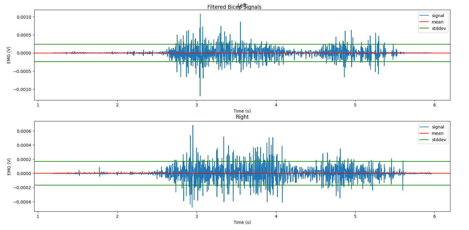
Notice that the raw signal looks pretty messy: we can sort of see that where the amplitude goes up is when the greatest muscle exertion happened, but it’s vague and subject to a lot of quick changes. Also, the mean isn’t necessarily at 0V, but we only really care about the changes from 0, so we’ll learn how to remove this offset properly when we filter the signal in the next section. Over the next several sections, we’ll learn about different ways of processing the signal so that we can get more meaning out of it, visually and numerically.
Filtering the Signal
The first step in any processing of signal data is to apply one or more filters to remove noise from the signal — without doing this, the performance of any machine learning system will be worse. There are two common sources of artifact noise in a biomedical signal such as EMG: powerline interference, caused by unwanted communication between other nearby electronic devices, and motion, caused by a small and relatively constant amount of energy being produced by the body at all times.
We won’t spend too much time on the math behind how different types of filters work, but know that they essentially use a process called convolution to modify the contents of the signal frequency. There are four main types of filters, described succinctly here (bold inserted for clarity): “The low-pass filter attenuates high frequencies, the high-pass attenuates low frequencies, the band-pass attenuates out-of-band frequencies, the notch attenuates a narrow band of frequencies.” [3] To attenuate means to reduce the effect of, so these filters are targeting and removing certain frequency ranges.
In our case, we’ll use LibEMG to filter the EMG signals. The API takes the name, cutoff frequency, and bandwidth of the filter in a dictionary format. You can also just use the default, “common” filters. Don’t worry too much about the parameter values for now; cutoff frequencies are recommended by the authors of LibEMG based on the frequencies at which these sources of noise commonly occur, and bandwidths can be modified later to remove frequency more or less harshly.
Finally, we have one more parameter to pass to the filter: sampling frequency. Sampling frequency is the rate at which samples are received from the sensor, in Hz. The Delsys Trigno sensors have several different options for this which can be configured during data collection; for this capture, our sampling frequency was 1259.259 Hz.
1from libemg import filtering
2
3SAMPLE_FREQ = 1259.259
4
5fi = filtering.Filter(sampling_frequency=SAMPLE_FREQ)
6fi.install_common_filters() # installs notch at 60 Hz, bandpass from 20-450 Hz
7emg_filt = fi.filter(emg_channels)
8
9fi.visualize_effect(emg_channels)
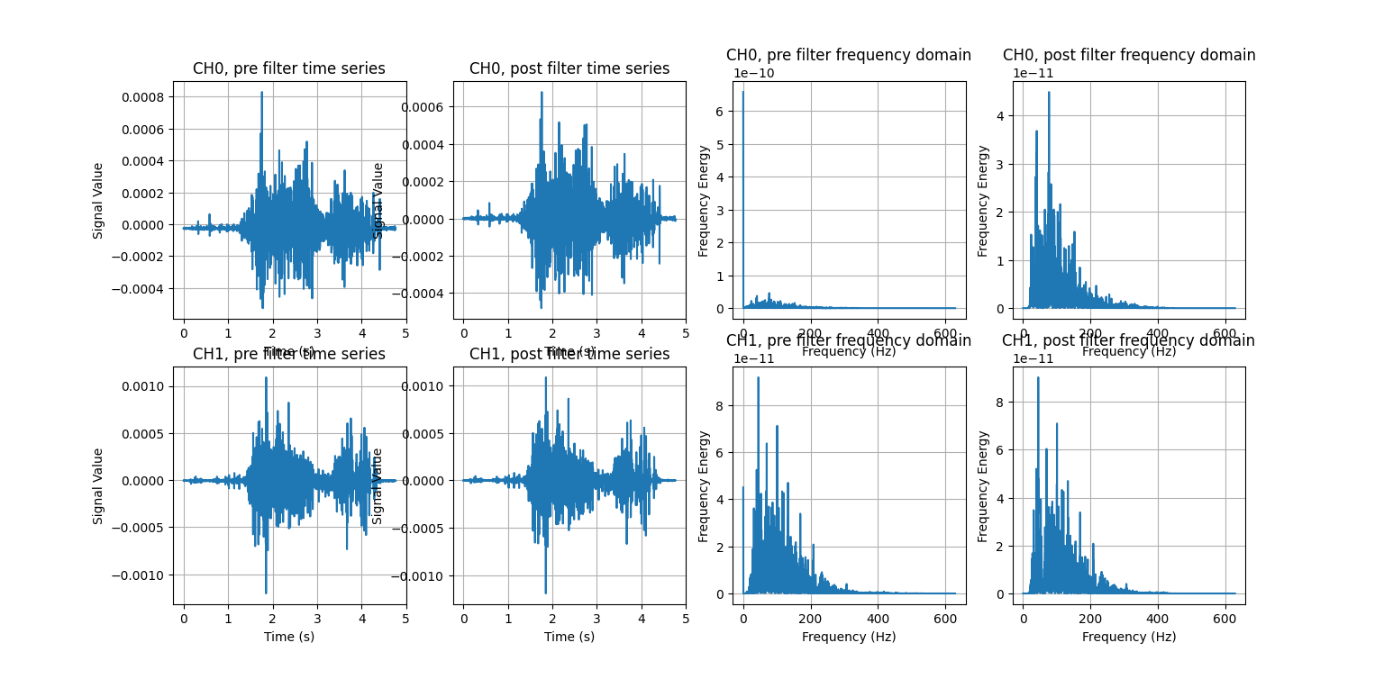
visualize_effect is a useful function provided by LibEMG: it takes the raw signal and produces a visualization showing the signal pre- and post- filtering in the time and frequency domains. We’ll explain what that last part means later, but for now, notice how the mean of the signal is now at 0V (like we wanted), and how the range of frequencies seen on the right are much more evenly distributed. We have successfully enhanced the quality of the signal without losing any of its key features.
Types of Visualizations
There are some special visualizations commonly used with signal data, and we’ll explore a few of them here.
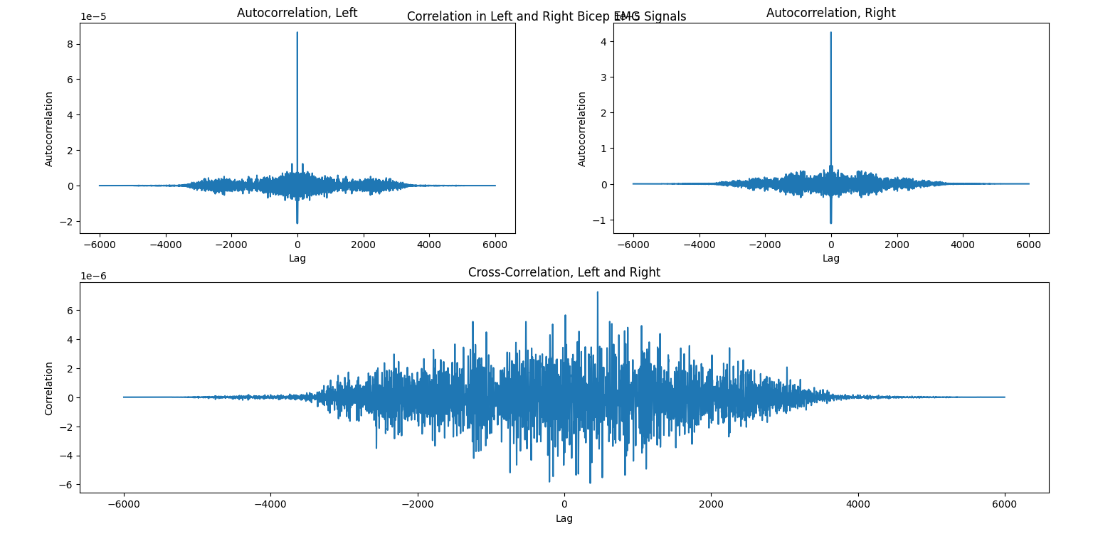
Autocorrelation and cross-correlation are used to measure the relationships between signals. Specifically, autocorrelation looks at periodicity, or repeating behavior, by correlating the signal with a lagged version of itself (correlation is a technical term, but again, don’t worry too much about the math here). So, lag 1 represents all samples from the signal that are 1 observation ahead of another sample (as determined by the sampling frequency), while lag -5 represents all samples that are 5 observations behind another sample. Cross-correlation does the same, but uses two signals instead of the same signal with itself. Higher positive values of correlation indicate high similarity between the signals; higher negative values indicate higher reciprocity (i.e., they are opposite each other), and values closer to zero indicate little relationship at all.
For an example of these concepts, suppose we were conducting a study to understand how people lift weights. Subjects wear sEMG sensors on their left and right biceps and complete successive bicep curls. If we wanted to see how regular the person’s motion is over time (to see if they fatigue, let’s say), we could use the autocorrelation of each arm’s signal separately. Meanwhile, if we wanted to compare the functioning of the left and right arms (to see if they are symmetric, let’s say), we would use the cross-correlation of the two signals. For more information about autocorrelaton and cross-correlation with EMG signals, see the referenced article. [4]
These can be calculated using the scipy.correlate function, which takes the two signals being correlated and some other optional parameters for the mode and method (we can use the default values for now). For visualization, this is a nice opportunity to learn how to use the nifty pyplot.subplots_mosaic function. It takes a string parameter for the pattern of grid layout that you’d like, and it’s especially useful for irregular patterns. The ; is used for a new row, and different letters each define their own plot, with the number of letters defining the relative spacing. Here, we have two plots for autocorrelation (left and right), but only one for cross-correlation. A clear way to display this visually is to place the autocorrelation plots next to each other but leave the cross-correlation on its own.
 1from scipy import signal
 2
 3auto_corr_right = signal.correlate(in1=emg_filt[:,0], in2=emg_filt[:,0])
 4auto_corr_left = signal.correlate(in1=emg_filt[:,1], in2=emg_filt[:,1])
 5cross_corr = signal.correlate(in1=emg_filt[:,0], in2=emg_filt[:,1])
 6fig2, ax2 = plt.subplot_mosaic("AB;CC") # two plots next to each other on the top row, then one on the bottom row
 7
 8ax2["A"].plot(range(-nrows, nrows-1), auto_corr_left)
 9ax2["A"].set_xlabel("Lag")
10ax2["A"].set_ylabel("Autocorrelation")
11ax2["A"].set_title("Autocorrelation, Left")
12
13ax2["B"].plot(range(-nrows, nrows-1), auto_corr_right)
14ax2["B"].set_xlabel("Lag")
15ax2["B"].set_ylabel("Autocorrelation")
16ax2["B"].set_title("Autocorrelation, Right")
17
18ax2["C"].plot(range(-nrows, nrows-1), cross_corr)
19ax2["C"].set_xlabel("Lag")
20ax2["C"].set_ylabel("Correlation")
21ax2["C"].set_title("Cross-Correlation, Left and Right")
22
23fig2.suptitle("Correlation in Left and Right Bicep EMG Signals")
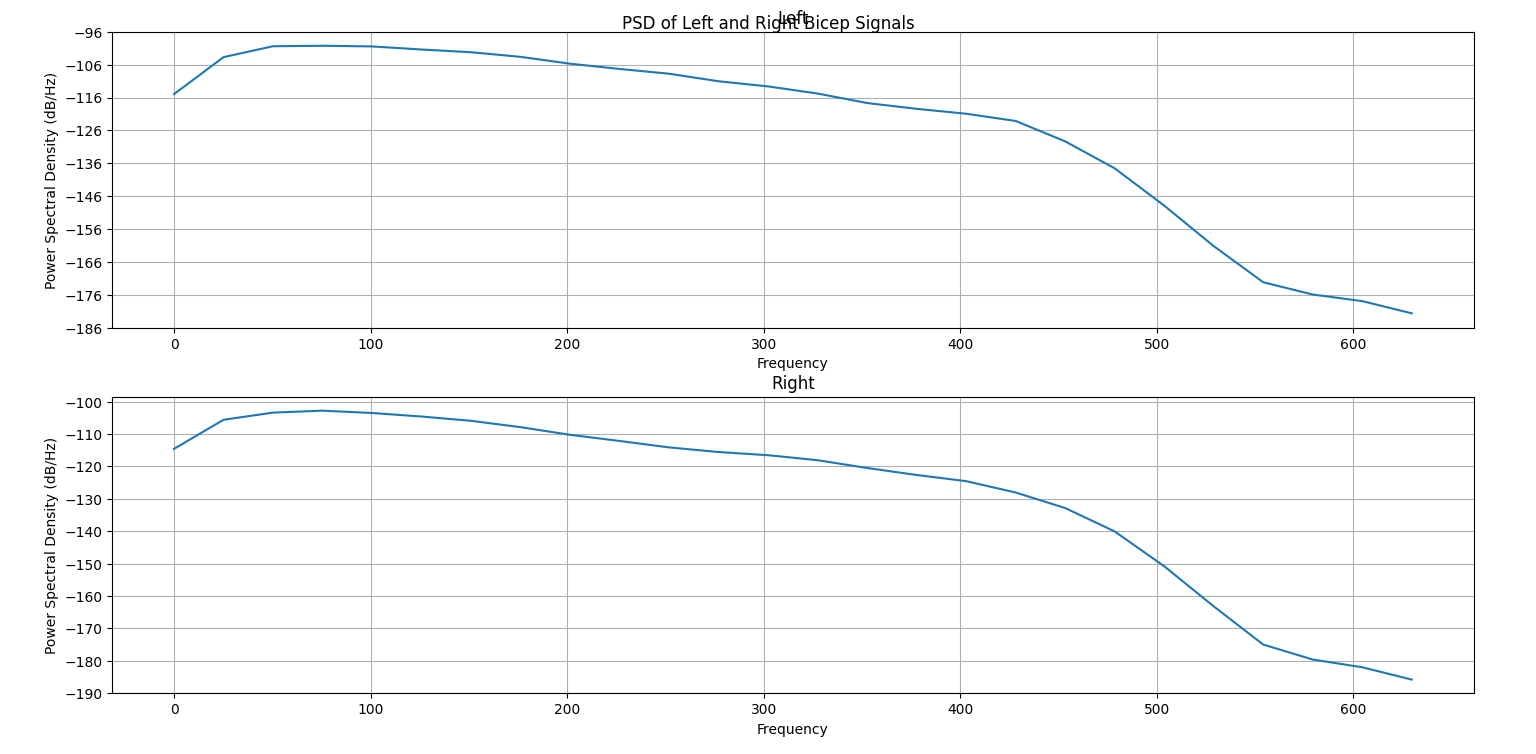
Another useful visualization for understanding the dominant frequencies of a signal is the power spectral density (PSD). It shows the power (squared magnitude) of the signal as a function of frequency. High peaks represent “strong” frequency components, or frequencies that occur with greater amplitudes, while low peaks represent “weak” frequency components. The code to generate the PSD for our example is below; luckily, Matplotlib has a built-in function to calculate and plot the PSD of a signal, pyplot.psd. We must specify a few parameters: Fs is the sampling frequency (see the explanation above), NFFT is the number of data points used in each block for an important mathematical operation called the Fast Fourier Transform that is used to generate the PSD, and noverlap is the number of points of overlap between the segments defined by NFFT. You are encouraged to specify different parameter values, including the defaults, and see how the result changes.
 1SAMPLE_FREQ = 1259.259
 2WINDOW_SIZE = 50
 3WINDOW_INC = 25
 4
 5fig3, ax3 = plt.subplots(2)
 6ax3[0].psd(emg_filt[:,1], Fs=SAMPLE_FREQ, NFFT=WINDOW_SIZE, noverlap=WINDOW_SIZE-WINDOW_INC)
 7ax3[0].set_title("Left")
 8ax3[1].psd(emg_filt[:,0], Fs=SAMPLE_FREQ, NFFT=WINDOW_SIZE, noverlap=WINDOW_SIZE-WINDOW_INC)
 9ax3[1].set_title("Right")
10fig3.suptitle("PSD of Left and Right Bicep Signals")
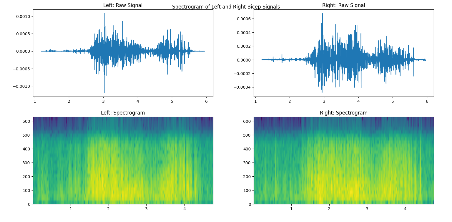
Finally, another useful visualization is the spectrogram, which represents how the frequency changes over time. It shows the power of each frequency component as a color map, with warmer colors mapped to stronger frequencies. In this sense, it creates a three-dimensional plot that allows us to view time, frequency, and power all at once! Matplotlib also has a built-in function for this, called pyplot.specgram. Its parameters are the same as the above psd. We’re showing how the frequency changes over time, so we’ll also plot the filtered signals above the spectrogram.
 1SAMPLE_FREQ = 1259.259
 2WINDOW_SIZE = 50
 3WINDOW_INC = 25
 4
 5fig4, ax4 = plt.subplots(2,2)
 6ax4[0,0].plot(time, emg_filt[:,1])
 7ax4[0,0].set_title("Left: Raw Signal")
 8ax4[1,0].specgram(emg_filt[:,1], Fs=SAMPLE_FREQ, NFFT=WINDOW_SIZE, noverlap=WINDOW_SIZE-WINDOW_INC)
 9ax4[1,0].set_title("Left: Spectrogram")
10ax4[0,1].plot(time, emg_filt[:,0])
11ax4[0,1].set_title("Right: Raw Signal")
12ax4[1,1].specgram(emg_filt[:,0], Fs=SAMPLE_FREQ, NFFT=WINDOW_SIZE, noverlap=WINDOW_SIZE-WINDOW_INC)
13ax4[1,1].set_title("Right: Spectrogram")
14fig4.suptitle("Spectrogram of Left and Right Bicep Signals")
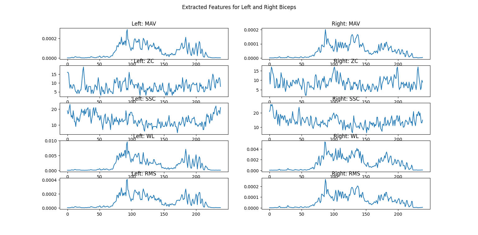
Feature Extraction
After using some advanced visualizations to understand patterns in the data, a process called feature extraction is used to perform calculations to transform the data into a form more useful for later algorithms. Specifically, the resulting features are often input into machine learning algorithms for tasks such as classification, and the features are used instead of the filtered data because they are more information dense.
There are far too many features used for EMG classification for us to describe them all here. Many of the most popular options are implemented in LibEMG, so refer to their documentation for more details. As an example for our data, we’ll implement the Hudgin’s Time Domain feature set, which is a classic group of features for analyzing how the signal changes over time. [5] It contains four basic features:
Mean Absolute Value (MAV): The average absolute value of the signal
Zero Crossings (ZC): The number of times that the signal crosses zero amplitude
Slope Sign Change (SSC): The number of times that the slope of the signal changes from positive to negative, or vice versa
Waveform Length (WL): The cumulative length of the signal (higher values indicate greater complexity)
LibEMG allows you to compute feature groups or singular features at a time; as an example of the latter, we’ll use Root Mean Square (RMS). RMS is very commonly used to represent levels of physiological activity. Features are computed over windows of the data, so we must specify the window size and the increment (how many samples the window is moved by each time). Finally, we’ll plot the features after running the extraction.
 1from libemg import feature_extractor, utils
 2
 3WINDOW_SIZE = 50
 4WINDOW_INC = 25
 5
 6fe = feature_extractor.FeatureExtractor()
 7windows = utils.get_windows(emg_filt, WINDOW_SIZE, WINDOW_INC)
 8features = fe.extract_feature_group('HTD', windows)
 9features["RMS"] = fe.getRMSfeat(windows)
10
11fig5, ax5 = plt.subplots(len(features), 2)
12for i,key in enumerate(features):
13    ax5[i,0].plot(features[key][:,1])
14    ax5[i,0].set_title("Left: " + key)
15    ax5[i,1].plot(features[key][:,0])
16    ax5[i,1].set_title("Right: " + key)
17fig5.suptitle("Extracted Features for Left and Right Biceps")
Next Steps…
That’s it for the basics of EMG analysis. Typically, the features we extracted would be fed to some classification algorithm: for example, you could try to classify the weight someone is lifting or the hand gesture they’re making based on EMG signals. Broadly, there are statistical classifiers — such as Random Forest, k-Nearest Neighbors, Naive Bayes, and others — and deep learning classifiers — such as multilayer perceptrons (MLPs), convolutional neural networks (CNNs), transformers, and others. Different features will lead to different accuracies based on the dataset and the classifier, so feature selection is an important process in modeling to obtain the best performance.
Heart Rate Analysis
To work through this part of the tutorial, we’ll use a sample file where a person repeatedly lifted 8 pound freeweights with both arms (at the same time). Their heart rate was measured using a Polar H10 sensor. The data can be downloaded here if you’d like to follow along!
Load Raw Data
Similar to the EMG section above, we’ll start by loading the raw data.
1import numpy as np
2
3ecg_data = np.loadtxt('sample_ecg_data.csv', delimiter=',', dtype=float)
4print(ecg_data.shape)
Notice that we have 1,241 rows (and only 1 column, which is implied). Each row represents the signal values read from the sensor at a particular time. Since we don’t have any timestamp information in this case, it’s important to remember the sampling rate of the sensor — in our case, 130 Hz.
Preprocessing
To plot the data, we’ll pass it through the processing pipeline first. We can do this using the ecg_process function from NeuroKit2, and then plot with the events_plot function.
1import neurokit2 as nk
2
3SAMPLE_FREQ = 130
4
5signals, info = nk.ecg_process(ecg_data, sampling_rate=SAMPLE_FREQ)
6
7rpeaks = info["ECG_R_Peaks"]
8cleaned_ecg = signals["ECG_Clean"]
9nk.events_plot(rpeaks, cleaned_ecg)
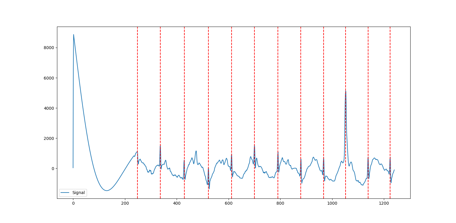
Let’s take a step back to understand what’s going on in the ECG signal, and then we’ll return to tackle the code. In general, an ECG signal can be divided into different sections based on what is happening physiologically as the heart beats. One cycle is referred to from start to finish as a PQRST complex, which has three distinct parts:
The P Wave represents the depolarization of the atria. This causes the atria to contract, pushing blood into the ventricles.
The QRS complex represents the depolarization of the ventricles. This causes the ventricles to contract, pumping blood throughout the body.
The T wave represents the repolarization of the ventricles. This causes the ventricles to relax, allowing them to fill back up with blood.
In order to determine the heart rate and heart rate variability, we must determine the time from beat to beat, or the time between two consecutive QRS peaks. So, the red dotted lines on the plot above represent the peaks determined using a peak detection algorithm.
Note
In many of the functions throughout the library, NeuroKit2 implements several algorithms which have been published and verified and allows the developer to select which one they would like to use. We’ll stick to the default options for our purposes here, but feel free to explore the differences between these algorithms on your own. For this particular function, the default option method='neurokit2' is unpublished, but according to the documentation: “QRS complexes are detected based on the steepness of the absolute gradient of the ECG signal. Subsequently, R-peaks are detected as local maxima in the QRS complexes.”
As for the code from NeuroKit2, the ecg_process function returns two dataframes: one containing the raw and cleaned signal, and one containing peak locations and some other information. Behind the scenes, this function is actually doing quite a bit! It uses six helper functions:
ecg_clean removes noise from the signal in order to improve peak detection accuracy.
ecg_peaks finds the R peaks in the QRS complex.
signal_rate finds the signal rate from a series of peaks by using
60/period(period is the time between peaks).ecg_quality assesses the quality by extracting a variety of features.
ecg_delineate delineates the QRS complex from the PQRST wave.
ecg_phase computes the cardiac phase, i.e., the systole (heart empties) and diastole (heart fills).
From there, we use the R peaks and the cleaned ECG signal extracted from ecg_process to make an events_plot, which displays this information graphically.
Analysis
We can do more with NeuroKit2 to look at heart rate and heart rate variability from the ECG signal. First, let’s use the ecg_plot function to get some more information on the processed signal from above.
1import neurokit2 as nk
2
3nk.ecg_plot(signals, info)
4
5# to extract the data shown in the plot
6rpeaks = info["ECG_R_Peaks"]
7cleaned_ecg = signals["ECG_Clean"]
8hr = signals["ECG_Rate"]
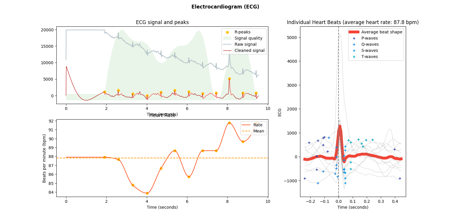
You’ll notice that this plot contains some of the same information as above in the events plot (the R peaks and the cleaned signal), plus a little bit more. However, the ecg_plot function computes these features automatically behind the scenes. Altogether, we now have:
R peaks detected from the processed ECG signal.
Some relative assessment of signal quality at each point throughout the ECG signal.
Heart rate over time computed from the processed ECG signal, including an average heart rate over the entire time.
Individual heart beats (PQRST complexes) overlaid with average wave shape, which is useful for determining any abnormal beats.
We can also look at heart rate variability (HRV), which is explained in more detail in Introduction to Physiological Sensors. We can look for a few different things with HRV: a decrease in HRV during training can indicate fatigue, and a significant decrease can even indicate over-training. Generally, a higher baseline HRV indicates a higher level of cardiovascular fitness.
HRV can be analyzed in three different domains: with respect to time, frequency, or non-linear analysis.
hrv_time returns a data frame containing 25 pieces of data. Important to note are standard deviation of NN intervals (normal-to-normal: intervals between QRS complexes) (SDNN) and the standard deviation of average NN intervals (SDANN). SDNN measures the heart rate variance over long periods of time, while SDANN is meant for shorter periods (e.g., 24 hours versus five minutes). While HRV is effected by demographic factors such as age, gender, and race, generally those with a HRV of 50ms or less are considered unhealthy, those with a HRV between 50-100ms have compromised health, and those with 100ms or more are healthy.
hrv_frequency computes ten HRV frequency domain metrics. Two important metrics are the high frequency (HF) and the low frequency (LF). HF is an indicator for the parasympathetic nervous system, which is responsible for the body’s functions during periods of relaxation, while LF is an indicator for the sympathetic nervous system, which is responsible for speeding up heart rate and slowing down digestion.
hrv_nonlinear computes 32 different metrics. Important to note is the standard deviation perpendicular to the line of identity (SD1). Put simply, it can be used as a short term measure of HRV. It is actually equivalent to the root mean square of successive differences calculated by
hrv_time.
The code to compute these metrics is shown below.
1import numpy as np
2import matplotlib.pyplot as plt
3
4SAMPLE_FREQ = 130
5
6hrv_time = nk.hrv_time(peaks, sampling_rate=SAMPLE_FREQ, show=True)
7hrv_freq = nk.hrv_frequency(peaks, sampling_rate=SAMPLE_FREQ, show=True, normalize=True)
8hrv_nonlinear = nk.hrv_nonlinear(peaks, sampling_rate=SAMPLE_FREQ, show=True)
Overview of Data Analysis Techniques
Let’s recap what we’ve learned by analyzing the data from each of these sensors, with a focus on the overarching processes and concepts that we followed. This section will serve as a useful reference for future work.
Time Series and Signal Processing
With each of the data types we saw two overarching methods of analysis: one looking at how the signal changed over time, and the other looking at how the signal was distributed over a range of frequencies. It turns out that these have been given conventional names as the two primary ways of analyzing signal data. The former is called time domain analysis, and the latter is called frequency domain analysis. Methods from both groups are highly valuable, and it’s important to incorporate both depending on the context of the problem.
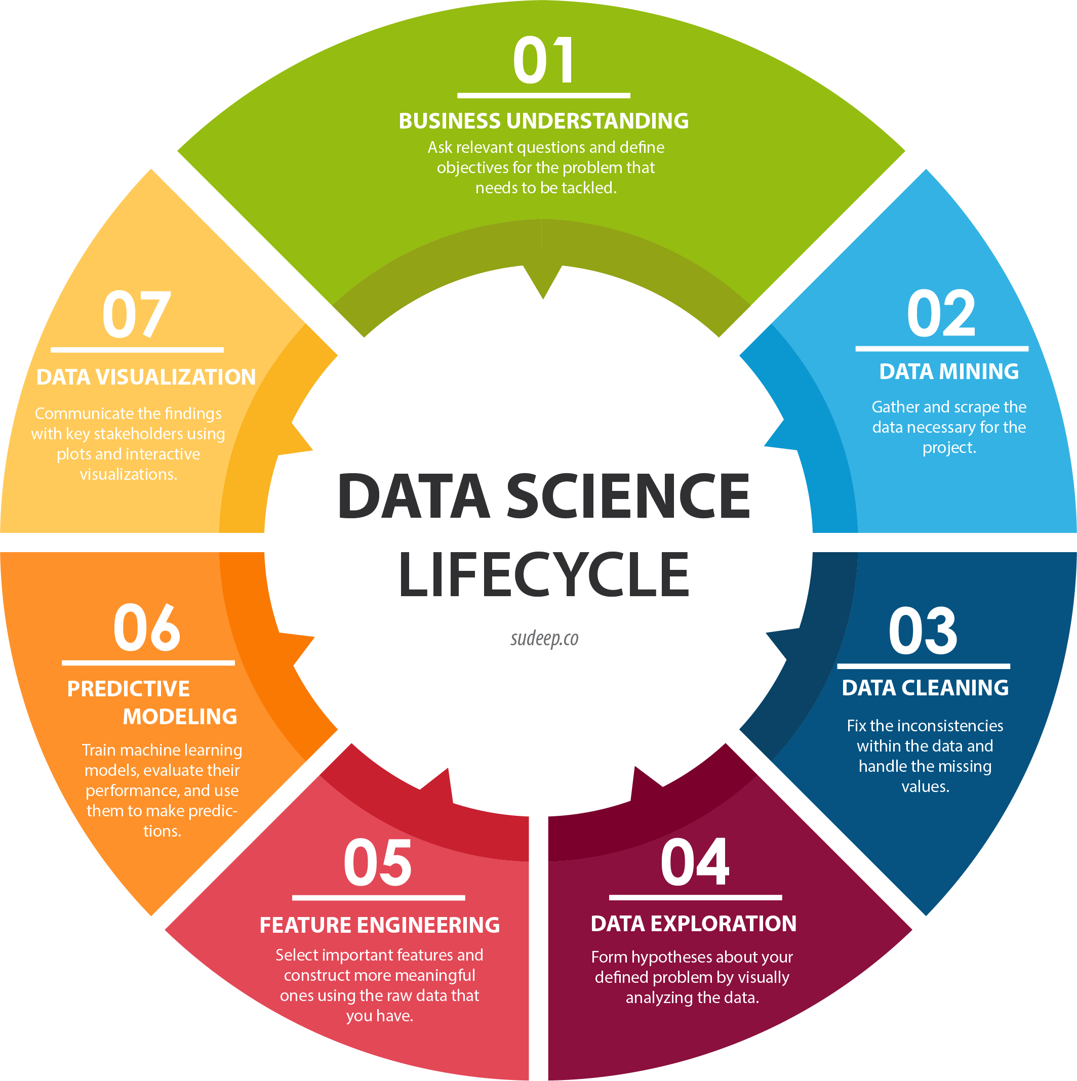
Data Science Process
Going all the way back to Data Collection with Physiological Sensors, we went through a process that started by asking questions, then collected some data, and went through a variety of steps to analyze that data. This is the core of data science, and as you become more experienced, you’ll start to notice the pattern in how this process most often proceeds. Let’s outline it formally here.
Research Question: First, the research question and hypothesis must be well-defined. What problem are you trying to solve?
Data Collection: Data is collected to attempt to address this question. A rigorous process may be needed to ensure that high-quality data is collected in an ethical manner.
Exploratory Data Analysis: This is the stage of loading raw data and performing basic operations to verify it. It includes quality checking (addressing low quality or missing data), aggregating, calculating basic summary statistics, and making visualizations.
Modeling: This is the core step of this process: developing a model based on the data and intuitions from the previous step to address the research question. For physiological signals, this step may involve feature extraction and classification. It also involves validation of the model’s quality and any assumptions that may have been made (methods for this vary).
Interpretation: Despite the model being the most technically important step, this step is arguably just as crucial. Not only is it necessary to understand what the results of the model mean, that understanding also needs to be communicated to key shareholders that are most likely not as familiar with the problem and/or the technology.
Below is a great graphic to illustrate a slightly modified version of this lifecycle (image from this blog).
Section Review
In this section, you were introduced to basic data analysis techniques for physiological data using Python. For EMG signals, you learned about filtering the signal to remove noise, visualizing the signal, and extracting some features. For the ECG signals, you learned about processing the signal to identify certain key stages of the heart beat, visualizing the signal, and computing some metrics. All of this will be important in the next stage of analysis, where we apply some of these skills to a real-world classification problem on a larger dataset. Excellent work so far!